
01 Overview
Giving Queso-Melt a fresh visual presence
During my internship at GFI, I developed campaign imagery and supporting graphics for Queso-Melt, one of the company’s private-label brands. The project combined food photography, styling, and graphic design to create a more expressive presentation of the products.
The assignment was described internally as a brand refresh. My contribution focused on the campaign’s visual expression: how the products were photographed, the atmosphere around them, and how those images translated into digital applications.
Making the product feel inviting
I wanted the imagery to communicate both the product and the experience around it. Bold color made the different varieties recognizable, while ingredients, chips, and serving arrangements helped connect the packaged queso to moments of eating and sharing.
02 Research & Direction
Finding a direction for the campaign
I began by looking at how other queso products were presented, considering their use of color, packaging, product descriptions, and food imagery. This helped me think about what the campaign needed to communicate at a glance.


I focused the direction around three priorities:
Appetite appeal
Show texture, ingredients, and serving details that make the food feel tangible.
Flavor recognition
Give each product a distinct color environment while keeping the series visually connected.
Personality
Use playful compositions and graphic elements to make the brand feel casual and approachable.
These priorities became a reference for decisions throughout the project, from selecting backgrounds to arranging props and developing the final layouts.
03 Visual System
Building a campaign around color and character
I developed a campaign direction using saturated colors, bold headings, handwritten accents, and playful food graphics. The existing Queso-Melt logo remained the brand’s identifying mark, while these supporting elements gave the campaign its own visual character.
The palette carried across both photography and graphic layouts. Green, orange, and red backgrounds created distinct settings for the product varieties and helped the photographs work together as a series.
The supporting illustrations added another layer of personality. Food motifs and simple decorative shapes could frame a photograph, emphasize an ingredient, or bring movement into an otherwise static layout.
I wanted the system to be flexible enough for different compositions while still feeling recognizably connected.


04 Shoot Planning
Turning the direction into a shot list
Before photographing the products, I worked with Tasha to plan our shot list. We considered both individual product images and fuller food arrangements so the shoot would produce a useful range of material for the campaign.
I led most of the creative direction, including the visual mood, styling, backgrounds, and compositions. Tasha helped me work with the camera and plan how we would capture the shots.
Thinking about the final layouts helped shape the photography. A close product image could become a focused promotional graphic, while an overhead arrangement could provide a fuller scene or accommodate a vertical crop.
The shoot became an opportunity to connect design planning with practical decisions about the camera, food, props, and available space.


05 Product Photography
Giving each variety its own moment
For the individual product photographs, I kept the arrangements focused: the container, a bold background, and a small selection of ingredients or serving elements.
This gave each image a clear focal point and kept the label prominent. Props provided context without competing with the product, while directional light and shadow added depth to the simple compositions.
Color helped distinguish the varieties. The green, orange, and red settings gave each photograph its own mood while the repeated approach to framing and styling connected the series.
These images formed the campaign’s clearest product-focused assets.


Showing the experience around the product
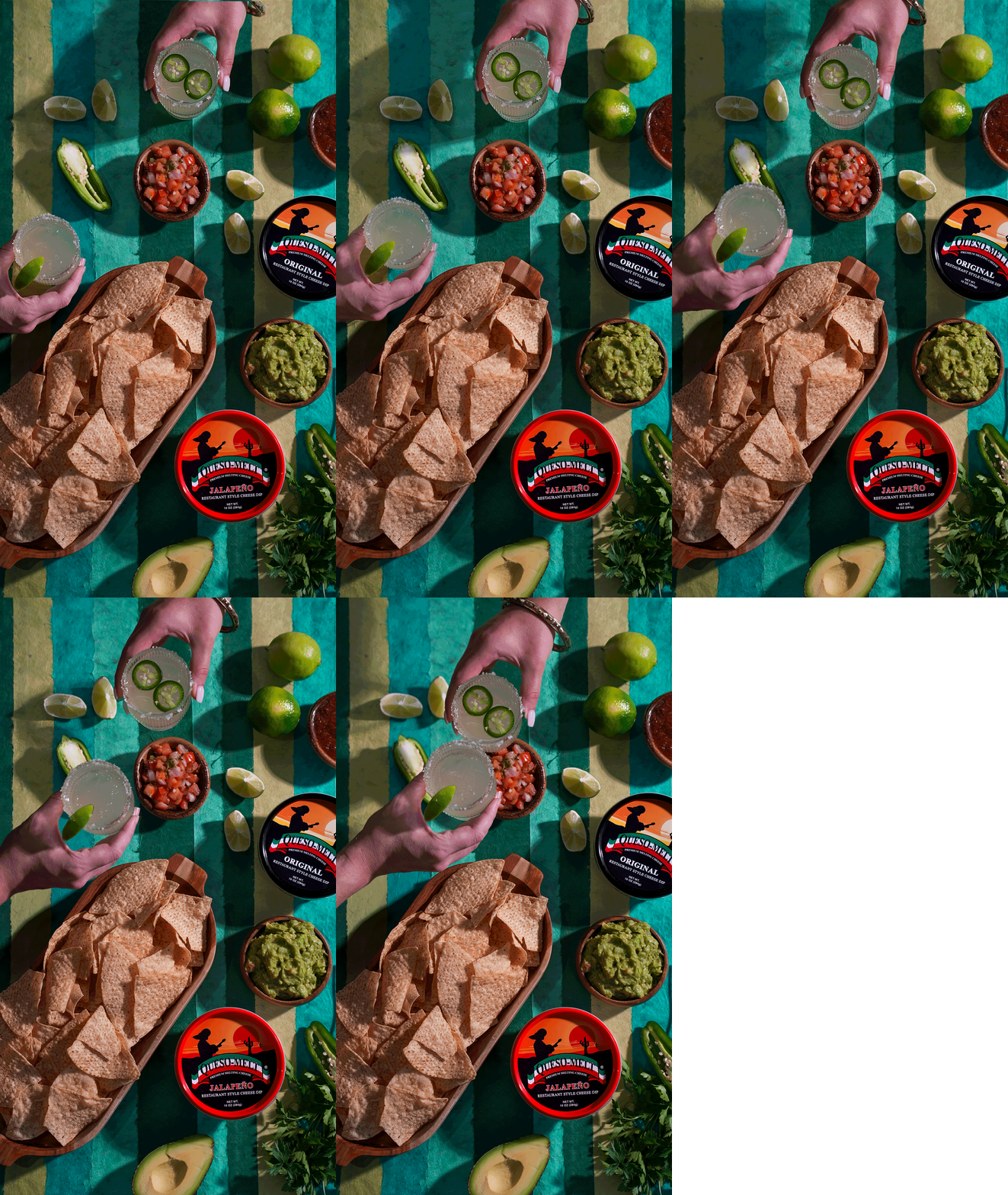
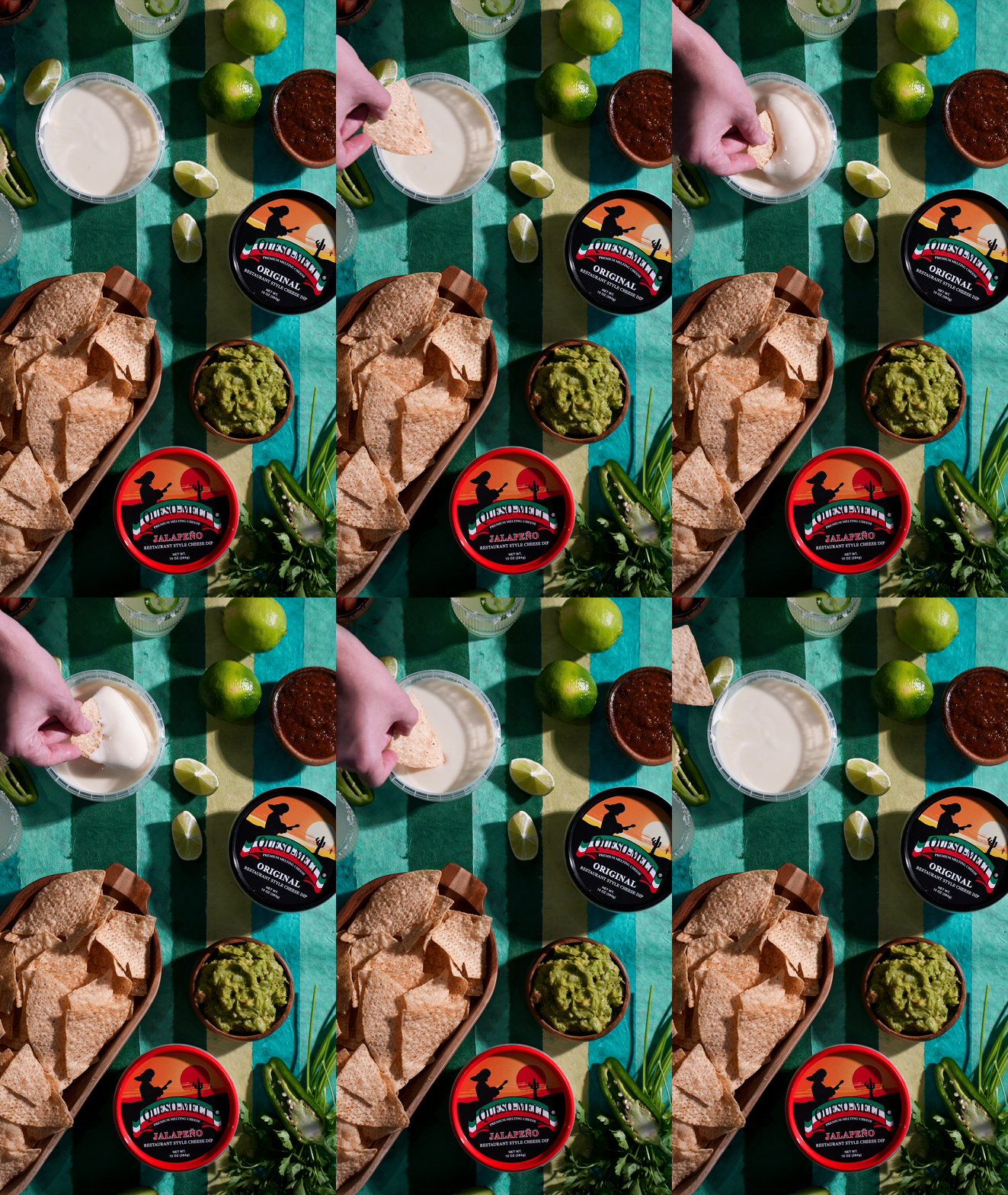
The overhead photographs expanded the campaign into a more complete food setting. Bowls, chips, ingredients, and open containers showed how the queso could fit into a casual serving arrangement.
I balanced the larger shapes of bowls and packaging with smaller details such as lime wedges, scattered chips, and textured surfaces. These elements gave viewers more to explore while keeping the product part of the overall composition.
Photographs that included hands introduced a sense of action. Reaching, dipping, and serving made the scene feel more immediate and helped communicate the experience of enjoying the food.
Together, the product and lifestyle images gave the campaign different ways to engage a viewer.

06 Campaign Applications
Bringing photography and graphics together
I applied the photography to digital campaign layouts, combining the images with the existing logo, campaign typography, color, and supporting graphic elements.
Each layout needed a clear hierarchy. The product or food image established the focal point, while the surrounding graphics reinforced the message and brought consistency across the set.
Working across different crops also helped me evaluate the photographs as design assets. I considered where the product sat within the frame, how much space remained for copy, and whether the composition still read clearly in a vertical format.
The final applications show how the photography and visual system could work together across a coordinated digital campaign.


07 Reflection
Taking ownership within an existing brand
This project gave me the opportunity to take creative ownership during my GFI internship while working within an established brand. I developed a direction through photography, styling, and campaign graphics, building on the recognition already provided by the Queso-Melt logo.
Working with Tasha showed me the value of combining a clear visual idea with practical production support. Her help with the camera and shot-list planning gave me room to focus on the compositions and overall creative direction.
Thinking beyond the individual photograph
One of my biggest takeaways was how closely photography and layout influence each other. Backgrounds, prop placement, and framing all affect how useful an image becomes when it moves into a campaign.
For a future shoot, I would plan even more deliberately around the final formats, capturing alternate crops and additional space for copy as part of the shot list.
The project helped me develop a more connected process, from visual research and art direction to photography and finished campaign applications.
